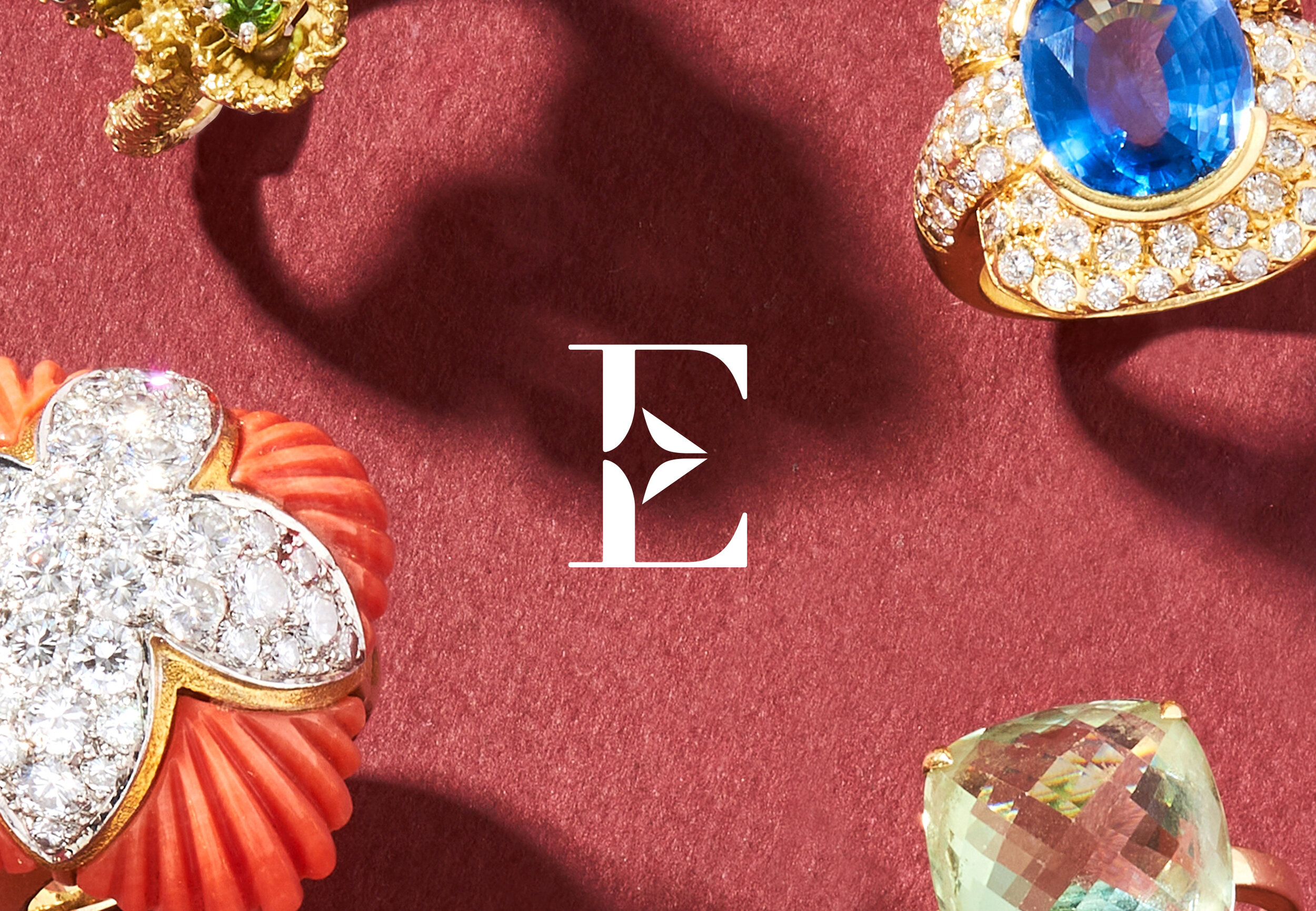
Brand identity for fine jewellery auction house.
Elmwood’s is a modern, accessible and conscious auction house, passionate extending the life-cycle of jewellery and watches. They specialise in authentic jewels and one-of-a-kind pieces that tell a story.
Working with strategy from Akana Collective, the brief was to develop an identity that could match the company’s ambition: to provide a transparent and modern alternative to traditional auction houses - to make buying and selling jewellery an easy and more pleasurable experience.
The Elmwood’s logo family draw inspiration from the shapes found in the leaves of the Elm tree - and the chiselled facets and refractive qualities of a cut stone.
The organic curves and linear angles form an unique symbol; a representation of nature and culture in harmony. These shapes are quietly echoed within the bespoke didone letterforms of the logotype and are combined to form the monogram.
Together, these elements create a family of brand marks that are evocative of the jewellery business and intrinsically tied to Elmwood’s ethos of sustainability.
In addition to the logos, the ‘1878’ editorial brand was developed to allow for differentiation between strands of communication, providing a new banner for Elmwood’s content that is informative or educational: the newsletter and blog ‘1878 Articles of Beauty’, and for social media ‘1878 Insights’ - short informative posts on the history of particular jewels, eras, designers or techniques.
2021 | ELMWOOD’S
Brand Identity, Guidelines / Brand Collateral
Images: Elmwood’s / CWR


