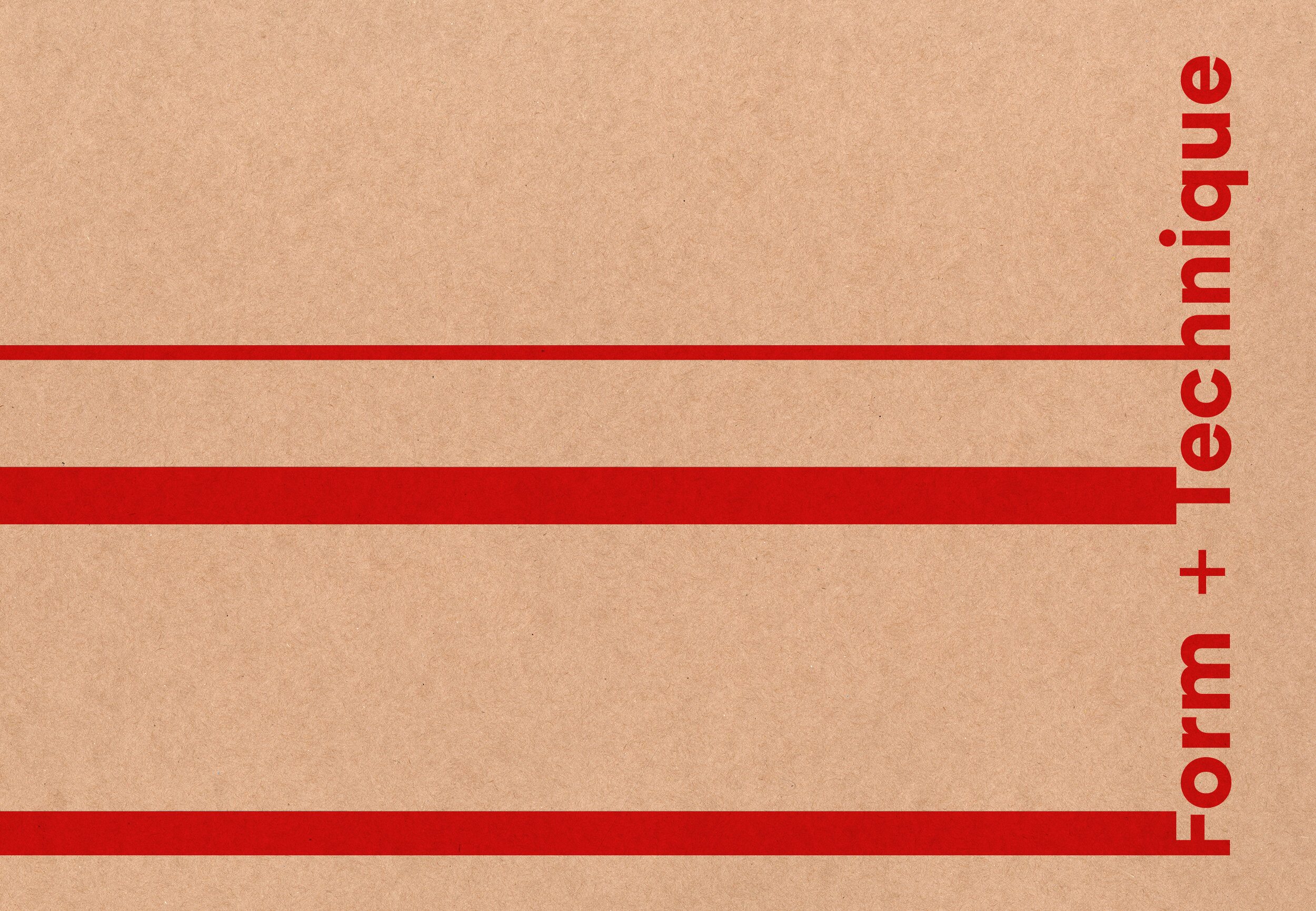
Book Series Design, ‘Form + Technique’ for Laurence King Publishing.
Series design for books covering a variety of architectural techniques and concepts.
The books are pocket sized and aimed at students as accessible guides, or to serve as inspiration to practicing architects. The functional aesthetic uses manilla cover stock, monotone images in basic print colours, with the series letterforms extended to wrap the front cover round to the back, providing a strong framework for the individual titles and content.
2016 | LAURENCE KING PUBLISHING
‘Form + Technique’ Book Series Design
AGENCY: PENTAGRAM (Partner: Angus Hyland)
Images: Pentagram / Nick Turner / CWR


