Brand identity, graphic system and series concepts for the UK's leading publisher of romantic fiction.
Following extensive market research, HarperCollins were looking to refresh the Mills & Boon imprint. The brief was to make the brand relevant to a modern audience, and create a more contemporary representation of romance without alienating the existing (extremely) loyal readership.
The new logotype reduces the scale of the ampersand in the previous identity and moves it back to its natural position between the founders’ names - shifting the emphasis to the overall Mills & Boon name—which is where the brand equity lies. Along with revised typography, the previous ‘rose’ ampersand has been replaced. The new version uses subtle heart-shaped geometry (and a ‘kiss’) as it’s foundation; the heart being a universal signifier of romance that places the brand idea at the centre of the new mark.
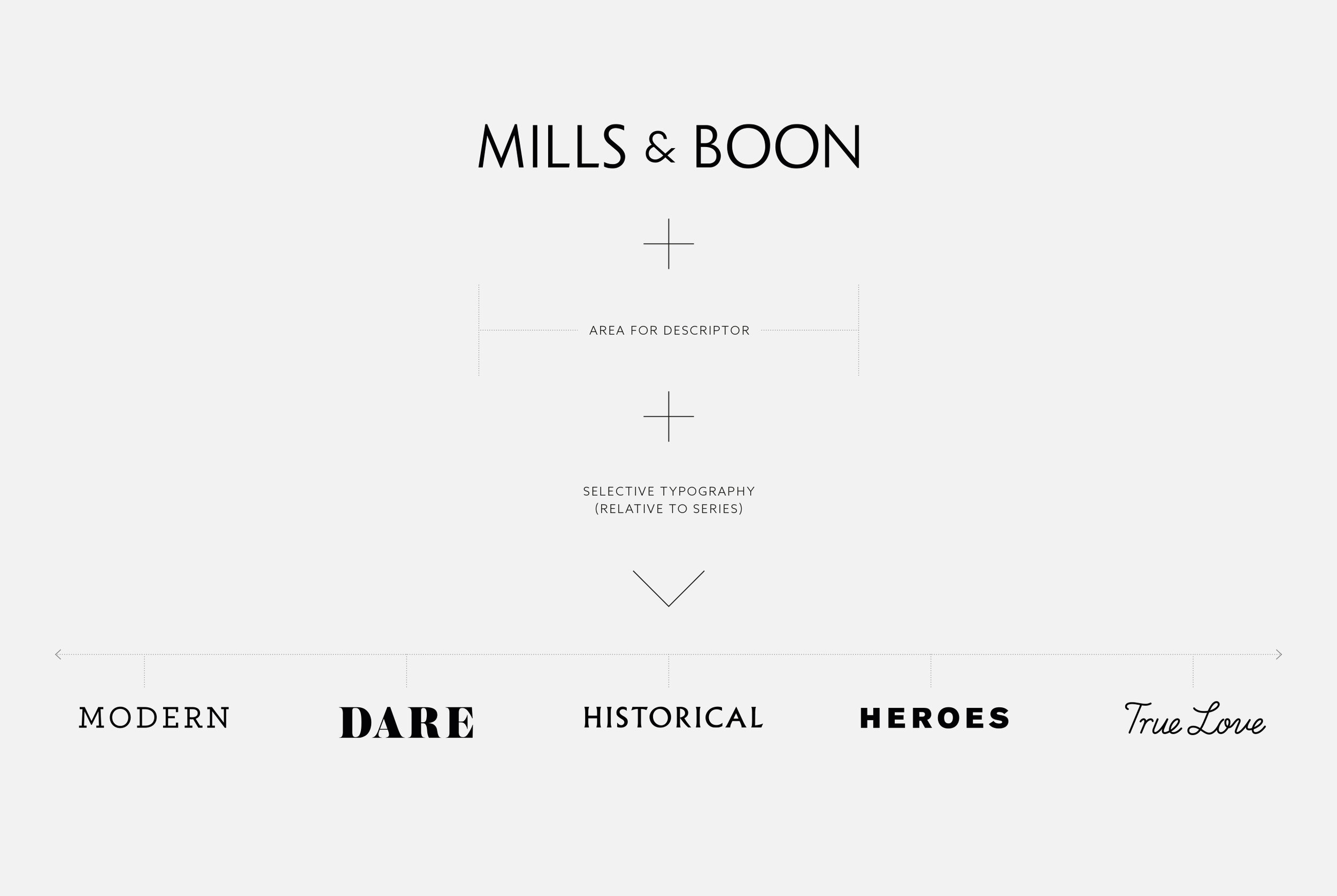
A key focus while developing the identity was to create a system that could flex and scale based on the series and its subject matter. The overarching brand can live on its own strongly when required, but can also work in tandem with Mills & Boon’s diverse range of series.
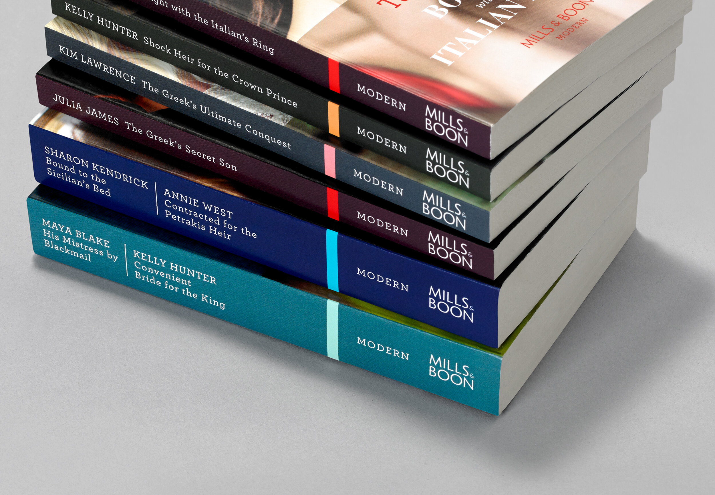
Alongside this, a series concept templates were devised. These needed to be capable of delivering cover artwork for the publisher’s high turnover of titles (120 per month)—which rely on stock imagery—yet focused enough to ensure that the brand communicates its core proposition to consumers.
As well as the overarching brand, directional concepts were developed for the newly defined series which would serve as a standard for their in-house team to refresh the remaining series.
2017 | HARPERCOLLINS PUBLISHERS / MILLS & BOON
Brand Identity, Brand System, Positioning, Redesign of 5 Series Concepts, Brand Guidelines
AGENCY: PENTAGRAM (Partner: Angus Hyland)
Images: Pentagram


